
The Passion Hub
One stop child development & Therapy Centre
UX/UI DESIGN
6 WEEKS DESIGN SPRINT

QUICK SUMMARY
The Passion Hub stands at the forefront of child development in Malaysia, setting new benchmarks in childcare excellence. Our website serves as an invaluable resource, offering comprehensive insights into our services, introducing our team of dedicated professionals, and fostering trust among parents through meticulously curated content. Moreover, I'm dedicated to guaranteeing seamless user experience, ensuring swift access to contact information and forms, enabling effortless communication with our team. Every facet of our website is designed to instill a sense of hope and positivity in every parent who embarks on this journey with us.

Getting started...
CHALLENGE
The Passion Hub is a medication start-up company based in Penang, Malaysia. Following our initial meeting, I found that the client's purpose of having a website is to provide users with comprehensive information about their services and identity. They expressed a strong desire for a vibrant and lively thematic approach that conveys positivity, distinct from the clinical atmosphere associated with hospitals.
Role
Solo UX/UI Designer
Tools
- Figma
- FigJam
- ProCreate
- Loom
GOAL
To serve as the central hub for information and contact related to the business. It should exude a vibrant and lively atmosphere, intentionally avoiding any clinical or hospital-like feel.
DESIGN PROCESS

Empathize
Business Analysis
Scheduled a meeting with the client to understand what needs, goals, and primary challenges and who is the target users. Here is the outcome:
Objective of Website:
The website serves a dual purpose. Firstly, it functions as an information center, providing comprehensive details about the services offered and other pertinent information. Secondly, it facilitates seamless communication between clients and the business.
Primary Challenge:
Given the nascent nature of the business, a significant challenge lies in building awareness about the services offered.
Target Audience:
-
Parents seeking professional guidance in identifying their child's specific concerns.
-
Parents who believe their child is encountering difficulties in day-to-day activities.
-
Established clients who have previously availed services at our clinic within the hospital.
Empathize
Understand the users
Goal: to understand the users' needs and expectations when searching for a child development clinic/center.
In the user research, I interviewed 7 parents. We can group these parents into 2 example groups:
1. Parents who regularly bring their child to see a specialist more than 5 times.
2. Parents who bring their child to see a specialist 1-2 times.


Conclusion:
After conducting the user research, I found that both types of users need help contacting specialists. They mentioned that it takes a lot of time to wait in line. It would be helpful if we had an online booking system. According to secondary research together with Shu Ling Kho's interview, mentioned that most parents are looking for a trustful platform where they can rely on the article and help to guide them on how to help their child get better at home.
Define
How Might We...
"How might we create a seamless and user-friendly scheduling system that allows parents to book appointments with the centre conveniently through the website?"
"How might we design a community space or forum within the "Parents Support" section, fostering connections among parents, enabling them to share experiences, support each other, and build a sense of community?"
"How might we design a comprehensive "Parents Support" section that offers a wealth of helpful articles, resources, and self-assessment tools for parents to better understand and support their children with special needs?"
I've presented these ideas to both my client and developer. Given the constraints in budget and manpower, we've refined our approach to ensure that the idea aligns well with the business goal and user needs. Our focus now is on
"How might we design a responsive website with streamlined contact options, allowing users to reach us effortlessly. This includes a one-click contact form and a 24/7 support channel on WhatsApp for appointment bookings, eliminating wait times. Additionally, we're establishing a dedicated parent support channel where specialists will provide insightful articles and resources."
Define
Goal
Based on HEART metrics, I will use H(Happiness) to measure the success of the website:
Goal: We aim to achieve 80% customer satisfaction for each section of our website through a Feedback Survey conducted via Google Form. Within three months of the website launch, we plan to send out the survey to all our clients via email with a target of receiving 20 responses. If any section falls below 80% satisfaction, we will carefully review the feedback and implement necessary website redesigns.
Ideate
Mood and Tone
After the goal has been set and the initial idea has been implemented, we are now looking into the client's logo, theme, and website references.
What client say
Lively, Colorful, Inspiration, Full of hope.
Big Note: I don't the website to feel like a hospital. Let's make it feel like a kindergarten school

Business Logo
Primary
Secondary
Tertiary
Business Main Color


Inspiration Board
Ideate
Website Architecture
I gathered the reference websites, style mood, and tone, I then drafted the website architecture and informed the client what would be information we would need to add to the website.

Ideate
Sketch
The website architecture has been set, I'm now laying out the elements of each page.


Ideate
Style Guide
After the low fi has been approved by the client, I am now working through the style guide of the passion hub's website.
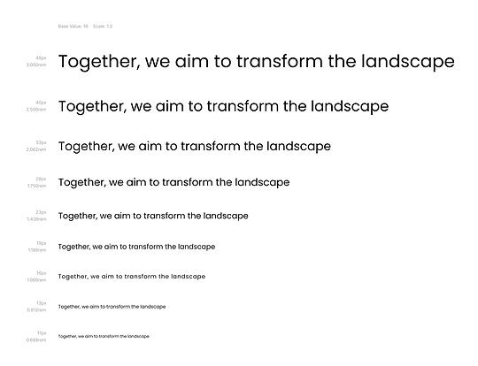
I use Poppins as a font because it offers good readability on both small and large screens. Poppins comes with a variety of weights and styles, which allows for creative flexibility. Also, the business doesn't need to pay to use Poppins.

Blue, Yellow and Pink are the colors of the business. However, I added purple here as the company's logo have it.
Ideate
Component
To make sure all the elements of my design are consistent. I've created components for my design.


Protoyping
High Fidelity
After receiving the final business information file from the client, I found that the client had added more details and topics. Hence, the High Fidelity layout will need to be redesigned according to the updated information.


At this stage of the design, I found it challenging as the information that the client wants to input into their website is 23 pages long and the client doesn't want to use the picture from the free resources. They mentioned that they want to input only text for now. Once the center is open, they will hire a photographer and use the pictures for their website. So, here is the services section without pictures.


At this point, I am not happy with the design as I feel that I could do better if I had images attached to the service details. Moreover, images will help new clients/ users to picture what the services will look like. I then informed the client about this concern again and asked the client to compare these 2 versions.

Picture's version

Without Picture's version
After the client approved the initial high-fidelity including the pictures for their services page, I then made changes and made sure that the high-fidelity was closed to the live website as much as possible, so the users would be able to give insightful feedback to improve my design.
Test
Usability Study
The research goals for this study are to identify the key challenges users face when navigating the website including searching for services, articles, who are our members, and finding contact details. Lastly, to understand what would be the topics that the users want to input on the contact form.

After receiving the feedback from the participants, I arranged a meeting with my clients. Before presenting the result what I found from the usability study. I have asked the same questions to the clients to gather feedback.

They pointed to the contact form page and would like to add all the services to the area of concern section. Hence, the topics below will be the parts that I will need to redesign:
Part 1: Website Navigation
-
Redesign the main service page
Part 2: Contact Form
-
Adding all the services to the area of concern
Test
Redesigning

First version

Current version
What are the changes here:
1. In the initial design version, I've implemented a zigzag layout. However, I aim for a simpler look for the website. Additionally, the content's length is considerable, necessitating a 'read more' option on the sub-page. To enhance convenience, the 'read more' button should be positioned at the left-hand side, near the box's end.
2. The inclusion of a related picture will assist users in comprehending the company's provided services more quickly and effortlessly.

First version

Current version
What are the changes here:
1. Layout: I've transitioned from a two-column layout to a single column due to the increased information in the contact box, which no longer fits within the set grid.
2. Text box style: I've ensured consistency by applying 30px rounded corners to all CTA buttons, and now the same corner style should be extended to the text boxes.
3. Wording: After comparing "Area of Concerns" with "Your Enquiry", I've determined that the latter version conveys a more considerate tone.
First version
Current version
What are the changes here:
1. In the initial design version, I've implemented a zigzag layout. However, I aim for a simpler look for the website. Additionally, the content's length is considerable, necessitating a 'read more' option on the sub-page. To enhance convenience, the 'read more' button should be positioned at the left-hand side, near the box's end.
2. The inclusion of a related picture will assist users in comprehending the company's provided services more quickly and effortlessly.


Feel free to tap on any devices that you would like to try the Hight-Fidelity Prototype. Enjoy ;)
Going Forward
Impact:
The website has not yet launched, however, here could be the impact that the design can help the business.
1. Reputation:
The website, by providing comprehensive business details, contact information, and profiles of team members, can significantly contribute to building trust among users.
2. Engagements:
The website serves as a direct point of contact with users. They can easily reach out through phone calls or real-time messaging on platforms like WhatsApp. Furthermore, the inclusion of a Google Map feature allows users to visualize the business location and read reviews from other customers, further enhancing user engagement.
3. Local Knowledge Hub:
With a dedicated parent support section, the business can offer valuable assistance and information to both their clients and the local community. This positions the business as a valuable resource and knowledge hub in the area. This not only benefits the clients but also strengthens ties with the local community.
Next step:
1. Gauge the success through the feedback survey outlined in the goal section.
2. Gather feedback to pinpoint areas for improvement.
3. Incorporate a customer satisfaction section on the Homepage.

A cheerful shoutout to all who explored my portfolio!
Your interest is truly appreciated!